- Is growth or decline concentrated on one device type?
- Are ranking and visibility changes different on mobile vs desktop?
- Which device should drive your next optimization sprint?
Before you analyze
- Keep the same date window when comparing devices.
- Check absolute volume first, then percentage movement.
- Check device shifts against recent page or template releases.
What this page gives you
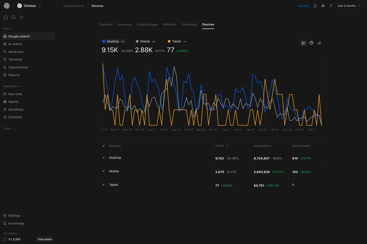
The Devices page combines:- Device trend lines for
Desktop,Mobile, andTablet. - Summary metrics per device to compare contribution and momentum.
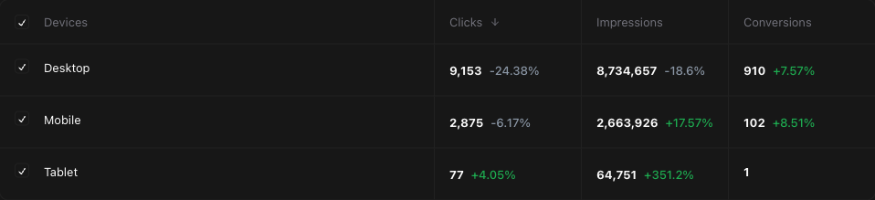
- A compact breakdown table with
Clicks,Impressions, andConversions. - Shared filters for keyword, page, device, and country segmentation.
How to read device performance correctly
Clickstells you current traffic contribution by device.Impressionsshows demand and visibility by device.Conversionshelps avoid optimizing only for traffic volume.
Quick weekly checklist
- Read the overall trend. Check whether all devices move together or one diverges.
- Compare contribution levels. Identify the dominant device and the fastest mover.
- Evaluate conversion quality. Avoid over-investing in segments with weak downstream impact.
- Link to release timeline. Match device shifts to recent page, template, or UX changes.
- Convert into focused tasks. Assign mobile, desktop, or tablet-specific fixes and owners.
How to use filters
Use filters to isolate root cause before assigning work.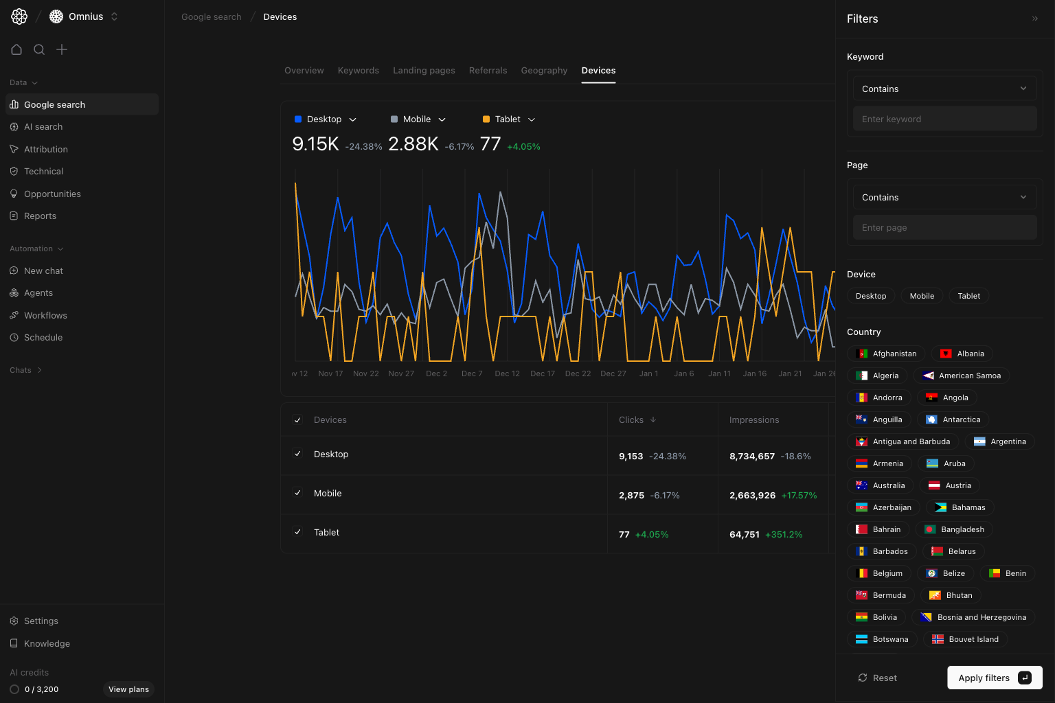
Device = MobileIsolate mobile behavior and validate UX-driven ideas.Page contains [/blog/ or /product/]Compare template-level device performance differences.Country = [market]Check whether device behavior shifts by region.Keyword contains [cluster term]Detect topic-specific differences in intent and CTR by device.
What to fix first
| Pattern in device data | What it usually means | Recommended action |
|---|---|---|
| Mobile down, desktop stable | Mobile UX or rendering issue | Audit mobile templates, performance, and search snippets |
| Impressions up, clicks flat on one device | CTR is weak | Improve titles/meta and intent alignment |
| Clicks stable, conversions down on one device | On-page friction after the click | Review layout, CTA placement, and forms |
| Tablet volatile with low baseline | Low sample-size noise | Monitor longer before high-effort changes |
| Desktop up, mobile down after redesign | Responsive layout regression | Run targeted QA and fix breakpoint-specific issues |
Team routine
- Weekly: flag largest device divergence and assign corrective tasks.
- Bi-weekly: validate if fixes improved target device metrics.
- Monthly: report device split trend and conversion quality changes.
- Quarterly: review device-specific template strategy and performance debt.
Keep in mind
- Tablet data can be sparse; treat large percentages carefully.
- Device type alone does not explain intent; pair with page and keyword segments.
- Short windows can overstate noise, especially on smaller traffic sources.
Where to go next
- Google Search overview: top-level trend context
- Landing pages: page-level impact by device behavior
- Keywords: query intent differences behind device shifts
- Geography: device performance differences across markets